Friday, 16 December 2011
My Progress in Photoshop
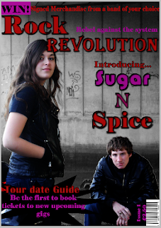
I took my photo at Myton Bridge in Hull. It took a few tries and had to go back to take them a couple of times. In order to get my colour scheme I looked at some older magazines and picked some colours that I thought would work well together.
I used two separate text boxes so that I can change the font of the mast head.
I used the layer style effect to change the writing. Although I changed the font of the mast head, I used the same effect on the different text boxes. I used the drop shadow and the inner shadow to form a black line around the title to make it stand out against the background image. I made it quite thick so that it would be easily seen.
I used the rectangle tool to make a banner at the bottom of the page. I pinpointed the colour of the mast head for the competition writing. I found a picture of the logo for Avril Lavigne's album and chose the pink off there and adjusted it to make it my own shade. I changed the levels on the picture to make it more dark and make it seem more gritty which would enhance the effect of it being a rock music magazine.
I used a bar code generator to make the barcode in the corner, rotated it and placed it in the corner. I used the same colour that i used for the sell line for the issue number and price. I looked around at the typical prices for music magazines and used the most used one.
I used the text box and chose the same font that i used for the 'Rock'. I used the layer style options for this in exactly the same way i did for the mast head.
For the black Splash i used the custom shape tool and selected the explosion style one. I used two separate text boxes over the top of it and wrote the texts. With the 'Tour date guide' I pin pointed the red from the mast head, I used the drp shadow and the inner shadow but this time did them different shades of red so that it looked 3d. I did the same for the pink of the sell line.
I used 3 different text boxes to make the band name. I used the pink from the sell line, the red from the mast head and found a different colour that was between them both. I chose a soft font font for the 'sugar' and a sharp font for the 'spice'. With the 'n' I chose a font that was a bit of both.
With the 'sugar' and the 'spice' i did the same effects as I did for the story in the corner. For the 'n' I made it more 3d and made it stand out by adding a bevel to it.
I took the advice from my teacher and put 3 black boxes around my band name to make it stand out even more.
Friday, 9 December 2011
My Photoshoot
I Like this picture that I took of my models. I like the way that they are looking at the camera and are standing back to back to show the differences between them, such as the gender and that there are differences of opinion. This could be relevant because the instrument that I am going to take a picture of them with is an acoustic guitar, this goes against the typical conventions of a rock group. I decided not to use this because my male model wasn't stood how I wanted him to. Also, the picture was brighter than I wanted it to be.
The reason why I didn't use this picture was that my male model wasn't stood in the place that i wanted him to be in. Also, my female model was smiling which I didn't want. I liked the lighting on this photo because it isn't too bright that it makes their faces look abnormal, but it wasn't too dark that it made them look too sinister.
I decided to try the urban background and found it looked effective. The lighting on the models looks good because it isn't too bright and isn't too dark which makes it easier to manipulate it. However, the reason that I haven't used to is because the space between them is too big. This could be a difficult thing to change, therefore, I will try to recreate this pose when I retake the picture but make sure that the models are closer together
I like this picture because it has an urban background which could represent the different aspects of the rock music industry. It is also more 'gritty' which is what is associated with the rock industry because the main colour of a rock music magazine is black and red. The idea that the girl is stood up, gives the impression that she is the lead singer, which goes against the stereotype because men are usually the lead singers in mixed two-person bands. I haven't used this because the light is too bright on their faces and I feel that this might be difficult to change.
Subscribe to:
Comments (Atom)


