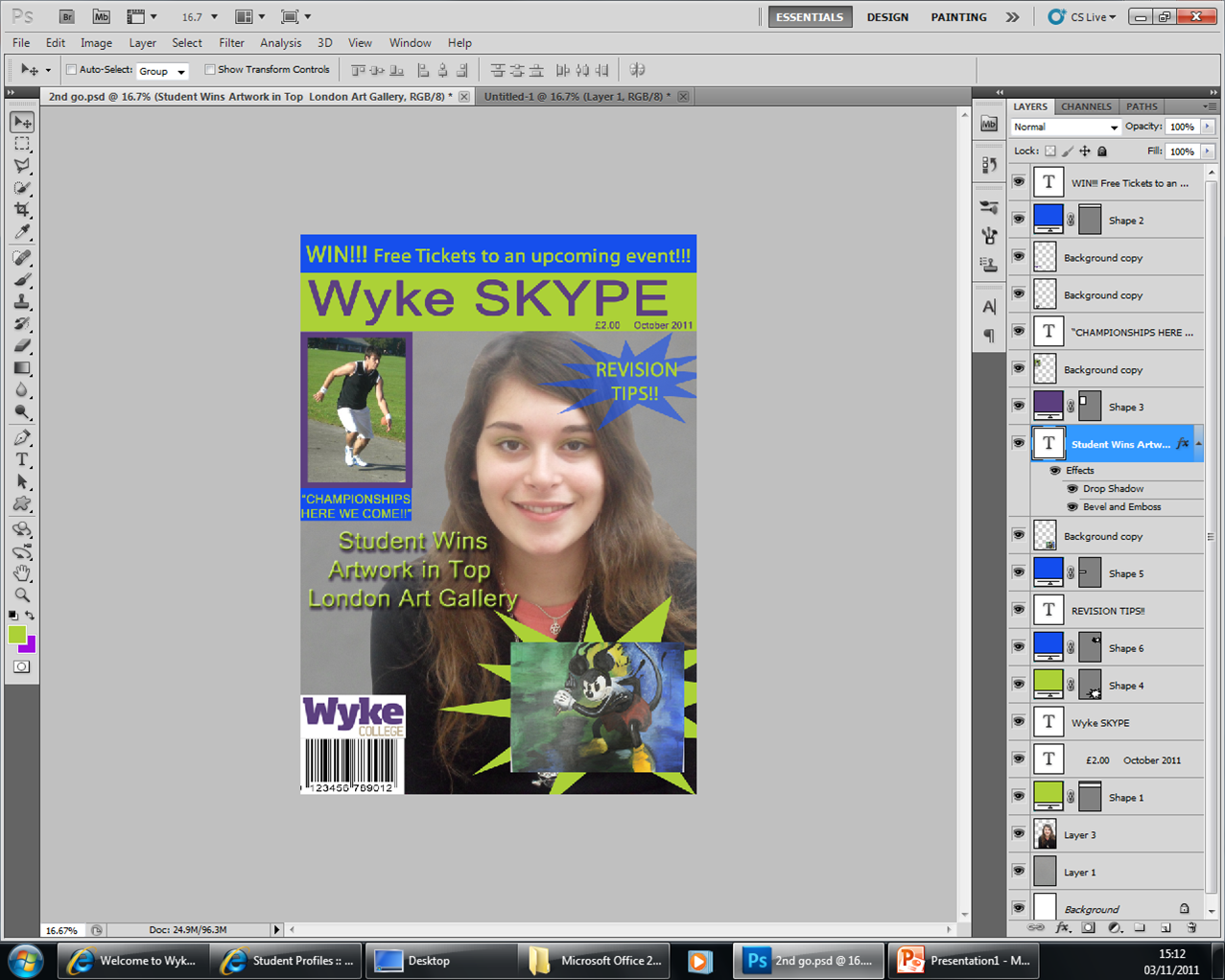
I have followed some of the conventions of a typical magazine. I have the put the competition on top of the page which is what I have learnt from other magazines that I have read and looked at. This is because when the magazines are stacked in the shops, the competition and the title are the first things that they will see. I put a picture of the painting within the flash graphic in order to make it stand out, but made it small so that people that buy this will want to see the picture in full. I put the main headline over the top of the picture and made it look better than the other story titles so that it stands out as the main headline. I made the sport story picture stand out by putting the purple box around it and making the story title stand out by putting it in a blue box with bright green writing. I put the date and price under the masthead and in a smaller text because it is still visible but out the way. I have put the model in the middle of my page so that she is the centre of attention and because she is the target of the main story. The competition appeals to a number of people because most students enjoy going to the student parties but feel that they can’t afford it because the prices are too high. Also, because the competition is in the skyline everyone is able to see it, and therefore has an equal opportunity to take part in it. The three main colours I have chosen represent the different aspects of the college, the blue represents the sport part of the college, and the green and purple are the standard college colours.
I have decided to include a sport story on the front page because Wyke is highly recognised for their sports department. However, I have made the story about the art department the main story as I feel the art department gets overlooked due to the fact it is a sports college. The teachers may feel that the magazine is a distraction; however, there are revision tips to ensure the students can get the most out of their courses. Each issue of the magazine would contain stories about different college departments, to make sure that the whole college gets the recognition that it deserves.
The magazine is mainly aimed at all the college students, but they’re likely to only read the issues that concern the courses they are taking or that they are interested in but aren’t taking. The magazine could also appeal to the family of students from the college because it can help them find out what it happening within the college.
By asking around the college, other students have positively commented on the prize of free tickets to the Wyke parties because they spend enough money travelling to and from college every day, getting to and from the parties and buying their drinks when they get to the party. Because the stories are written by students, I feel that the readers are getting a students’ point of view on what is happening around the college. The fact that the painting is a well-known childhood character, gives the sense of familiarity and comfort which makes students feel that they can relax within the art department, even if they aren’t taking a subject in the department. They also believe that they would buy this magazine because it is unique to our college, due to the fact that the colour scheme is the college colours.
While making this magazine cover in Photo shop, I have learnt that the tools take a while to get used to but they worked together effectively for what I was trying to achieve. I learnt that the quick selection tool isn’t always necessary when cropping aspects out of a photo. I have learnt that when cropping people out of a photo, sometimes it is best to use the polygon lasso tool, it may be time consuming but the results are enhanced. I learnt how to add effects to a certain piece of text to make it look more professional and to make it stand out against a busy background. When taking photos I learnt to take light and composition into consideration, and understand how the image will help my magazine appeal to the target audience that I wanted it to. I used my own digital camera to take my pictures; this helped me because I already understood the different effects that I can get on my camera have and the different types of shots I can get from my camera. I found that the angle of the photo makes a big difference to the image of the magazine cover. This is because it can change how the cover looks dramatically. I have never used Blogger before so I had to learn how to use that in a short space of time and learn how to add pictures and change the format of a save in order to add the pictures to my blog. I started to try and learn to use Prezi, however, I soon stopped using it because I couldn’t understand it, but I feel that this would have helped the planning of my work more if I had continued to use it. In order to get my paper drawings into the computer, I had to learn how to use the scanner, I will be using this in the future because I find it easier to plan my work using paper drawings and being able to show my friends and get their opinion and make any changes that they think would improve it.