Tuesday, 14 February 2012

Photoshoot for contents and Double Page spread

With this picture I was hoping to get some images of my two models on their own to act as some of my double page spread, to show them both in the song writing stage of their development.

I thought that by using a confused expression, it would portray the leader how a leader of a band would naturally be when it comes to writing a song.

By taking the pictures in my home, I thought it would gave the impression that they are either in a hotel room creating music or in the magazine studio 'green room' waiting to perform for the people that work there.

By having them sat on the floor would give the idea that they are comfortable with making music together. I didn't use this picture because my female model is smiling, and because you can see a picture frame in the background. Also, both artists don't have shoes on which would be seen as unprofessional.

I thought the idea that my female model looks like she is rehearsing her lyrics would look affective along with my male model looking like he's playing along with her. However, I didn't use this picture because the fact that my female model hasn't got any shoes on is visible at the bottom of the screen

I thought the idea that the photo was taken on a jaunty angle was good because it gives the impression that they are different and unique to any other bands. I didn't use this picture because you can see that both models have no shoes on which would be unprofessional if they are in the magazine 'green room'


I thought the idea that seeing 'Max' tuning up the guitar would be affective because it would give the impression that they are still getting started because he hasn't managed to get the guitar tuned up right yet

These next few photos were a few story boards that we put together after looking at Kerrang Magazine. This image is of 'Roxxi' showing 'Max' the lyrics and the music that he has to play to accommodate the lyrics.

This one is of 'Max' disagreeing with 'Roxxi' and making his own contribution to the song, but maybe going the wrong way about it 

This was 'Roxxi' taking back her work and pulling a face which distinctly tell 'Max' that his idea is really stupid and that it wasn't going to happen. 

This is a different story board that is where 'Max' ruins what 'Roxxi' has done. In this image 'Roxxi' is showing 'Max' what she has written and is performing it for him.
These next two were taken the wrong way round, this is the end result of 'Max' and 'Roxxi' arguing over the lyrics of a certain song. My male model had to put the paper on the guitar so that we could see it in contract to the cushions behind them.

This image is the second one in this specific storyboard, it is 'Roxxi' and 'Max' fighting over the paper with the lyrics on them, which ended in the previous picture. If I was to use this picture I would have to Photoshop the ripped paper off the floor because this is a mistake we made and I didn't notice it.

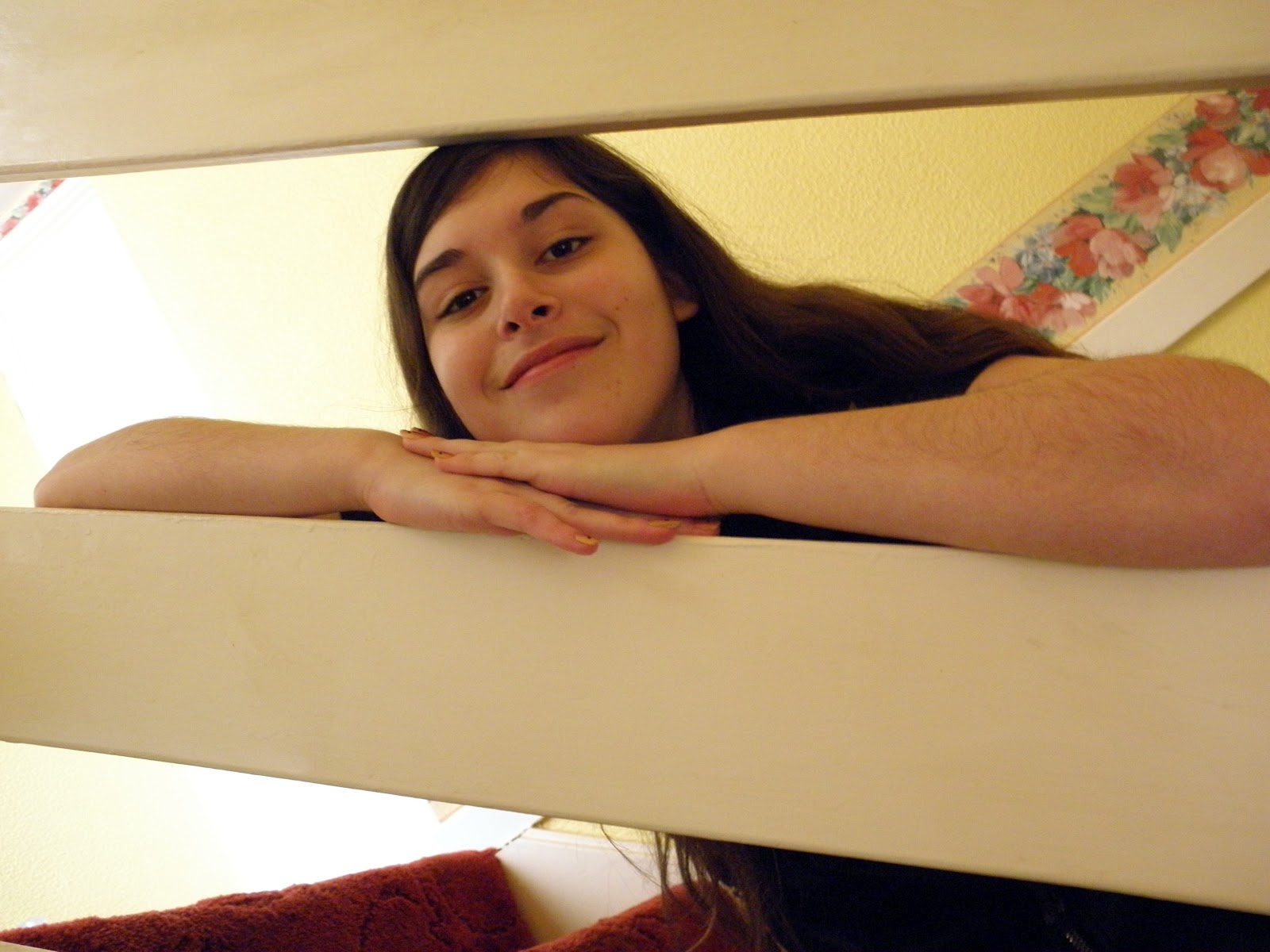
These next pictures are ideas that I have for a photo shoot that I didn't have time to do, but will do for my final draft. This is that I will find a rural area and take the pictures on a staircase where it looks more like the image on my front cover. 

I didn't use this picture because it was too blurry since I didn't have my arm resting on anything

This was another image that was too blurry to use

This picture looked too soft compared to the others that I was going to use

This image looked too soft too

This is another photo I will take with my other photo shoot

These were some fun ones that I thought I could use in my contents page.


Final Front Cover

Friday, 10 February 2012

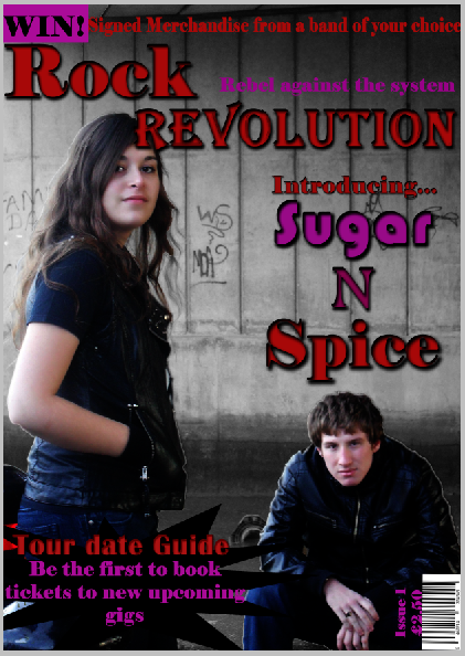
Screenshots up to my final draft of my front cover

 I opened my first draft of my magazine front cover and hid all the layers apart from the picture. I then clicked on the quick selection tool and selected my two models.

I right-clicked my models and created a new layer via cut, creating a layer with my models and another layer with the background on.

 I clicked the background layer and selected the image menu, and selected the black & white tool

I then clicked the layer with my models and clicked the image menu, then clicked the levels option.
After i clicked the levels option, the pop-up came up, i changed the red, green and blue levels to 0.75 to make the picture darker to give it a grungier feel.

I then blurred the outline of my models to make them blend in with my background.
I turned on all my other layers and started to move the black boxes around my main headline down

I clicked the box around 'Spice' and clicked the edit menu, and went to the transform fold-out menu and clicked the scale option.

I changed the size of the box so that it contained all of the word 'Spice', I held the 'Shift' button down to make sure that the box moved in proportion.

I then moved the 'Introducing', 'Rock' and 'Revolution' down so that there would be enough room on the top for a skyline.

I then hid the competition writing at the bottom of the page and clicked the box that surrounded it. I went to the edit menu and then to transform and scale.

I made the box smaller and moved to the top of the page to create a skyline. I then turned on the competition layer and moved it to the top to make the skyline.

I then made the box pink. I deleted the word 'WIN!!' from the original text and put it in another text box in order to be able to make it a different colour to the rest of the skyline to make it stand out.

I then moved the splash, barcode, issue number and price down to the bottom of the page to make sure that the full page was taken up.

I then got advised to remove the blocks from around my main headline, so I hid the layers (just to make sure that I still had them if it didn't look right)

I clicked on the 'spice' layer and added a drop shadow and inner shadow to create the same effect that I had for the 'Rock' and 'Revolution'

I did the same to the 'n' and 'sugar'
I decided to change the issue number in order to make it easier for me when I'm creating my contents page.

Friday, 16 December 2011

Different Variations of my front cover


My Progress in Photoshop

 I took my photo at Myton Bridge in Hull. It took a few tries and had to go back to take them a couple of times. In order to get my colour scheme I looked at some older magazines and picked some colours that I thought would work well together.

I used two separate text boxes so that I can change the font of the mast head.

 I used the layer style effect to change the writing. Although I changed the font of the mast head, I used the same effect on the different text boxes. I used the drop shadow and the inner shadow to form a black line around the title to make it stand out against the background image. I made it quite thick so that it would be easily seen.

I used the rectangle tool to make a banner at the bottom of the page. I pinpointed the colour of the mast head for the competition writing. I found a picture of the logo for Avril Lavigne's album and chose the pink off there and adjusted it to make it my own shade. I changed the levels on the picture to make it more dark and make it seem more gritty which would enhance the effect of it being a rock music magazine.

I used a bar code generator to make the barcode in the corner, rotated it and placed it in the corner. I used the same colour that i used for the sell line for the issue number and price. I looked around at the typical prices for music magazines and used the most used one.

I used the text box and chose the same font that i used for the 'Rock'. I used the layer style options for this in exactly the same way i did for the mast head.

For the black Splash i used the custom shape tool and selected the explosion style one. I used two separate text boxes over the top of it and wrote the texts. With the 'Tour date guide' I pin pointed the red from the mast head, I used the drp shadow and the inner shadow but this time did them different shades of red so that it looked 3d. I did the same for the pink of the sell line.

I used 3 different text boxes to make the band name. I used the pink from the sell line, the red from the mast head and found a different colour that was between them both. I chose a soft font font for the 'sugar' and a sharp font for the 'spice'. With the 'n' I chose a font that was a bit of both.

With the 'sugar' and the 'spice' i did the same effects as I did for the story in the corner. For the 'n' I made it more 3d and made it stand out by adding a bevel to it.

I took the advice from my teacher and put 3 black boxes around my band name to make it stand out even more.

Friday, 9 December 2011

My Photoshoot


I Like this picture that I took of my models. I like the way that they are looking at the camera and are standing back to back to show the differences between them, such as the gender and that there are differences of opinion. This could be relevant because the instrument that I am going to take a picture of them with is an acoustic guitar, this goes against the typical conventions of a rock group. I decided not to use this because my male model wasn't stood how I wanted him to. Also, the picture was brighter than I wanted it to be.


The reason why I didn't use this picture was that my male model wasn't stood in the place that i wanted him to be in. Also, my female model was smiling which I didn't want. I liked the lighting on this photo because it isn't too bright that it makes their faces look abnormal, but it wasn't too dark that it made them look too sinister.


I tried this background because I thought it would represent the different aspect of rock music that they are going to attempt to re-create. They are a rock band that play just acoustic guitars, therefore they are different to any other rock band that there is.


I decided to try the urban background and found it looked effective. The lighting on the models looks good because it isn't too bright and isn't too dark which makes it easier to manipulate it. However, the reason that I haven't used to is because the space between them is too big. This could be a difficult thing to change, therefore, I will try to recreate this pose when I retake the picture but make sure that the models are closer together


I like this picture because it has an urban background which could represent the different aspects of the rock music industry. It is also more 'gritty' which is what is associated with the rock industry because the main colour of a rock music magazine is black and red. The idea that the girl is stood up, gives the impression that she is the lead singer, which goes against the stereotype because men are usually the lead singers in mixed two-person bands. I haven't used this because the light is too bright on their faces and I feel that this might be difficult to change.